A New Look for Hello Tham: Designing v5.0.0 with Claude
Our website has been redesigned from the ground up — an editorial design system called Rosely, conceived in Claude Design and implemented with Claude Code.
 Chris ThamMon Jul 27 2026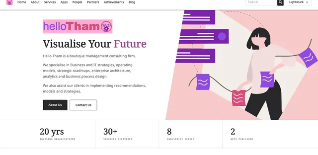
Our website has a new look. Version 5.0.0 is a complete visual redesign — new typography, a new colour system, new pages, and a great deal of new content — while keeping everything that made version 4.0.0 fast.
If the previous release was about the engine, this one is about the bodywork.
Why redesign at all?
The old site was perfectly serviceable, but it looked like what it was: a template with our colours applied. Nothing about it said boutique consulting firm. Everything was rounded cards, drop shadows and generous purple.
We advise clients on how to express strategy clearly. Our own website ought to do the same thing — so we went back to first principles and asked what a consultancy site should feel like. The answer we kept coming back to was editorial: the visual language of a well-set magazine or annual report. Serif headlines. Hairlines instead of shadows. Numbered indexes. Plenty of white space and a lot of restraint.
Designing in Claude Design
The design itself was created in Claude Design, Anthropic’s design tool, running Claude Opus. Rather than commissioning a single mockup, we explored several complete directions side by side — each a full, interactive page rather than a static picture, which made it much easier to judge how a direction would actually behave.
The direction we chose, “Blended Direction”, became the specification for the build: type scale, spacing rhythm, the treatment of rules and eyebrows, and the palette in both light and dark.
Rosely, applied to ourselves
The colour system is Rosely, our own design system — the millennial pinks and purples we publish as a product. It has always been our palette in spirit, but this is the first time it is implemented on our own site as a proper token system rather than a set of hex codes sprinkled through the markup.
Every colour is now a Tailwind CSS v4 @theme token — ink, cream, quartz, mulberry, rose, aqua, grape, plum — used consistently across every page, with a dark variant for each. Adjusting a shade is a one-line change, and the ISO-style discipline appeals to the enterprise architect in me: define once, reference everywhere.
Along the way we recomputed the contrast ratios and darkened our signature mulberry so that body text and links now meet WCAG AA against both cream and white. Good design should be legible design.
Implementing with Claude Code
The implementation — the part where a design becomes a working, accessible, fast website — was done in pair programming with Claude Code, running Claude Fable, Anthropic’s most capable model.
This was genuinely collaborative work rather than code generation. I directed; Claude implemented, verified in a real browser, and reported back with screenshots. Some of what came out of the sessions:
- Bespoke pages for About, People, Partners, Apps, Services and Achievements, replacing generic collection templates with layouts designed for their content.
- An Achievements page that parses our
work.mdfile at build time into a year-grouped timeline, so the source of truth stays a single markdown document I can edit directly. - Illustrations recoloured from unDraw into the Rosely palette — a scripted colour-mapping pass, verified by histogram rather than by eye.
- Accessibility fixes throughout: a skip link, a single main landmark, correct listbox semantics on the theme switcher, and the contrast work described above.
- Fonts migrated to Astro’s native Fonts API. The variable Noto families are downloaded at build time and self-hosted with preload links, so no third-party font requests are made at runtime — better for privacy and for first paint.
- The blog rebuilt in the same language: article pages now open with a serif headline, a byline rule and the cover art in its own panel, rather than white text floating over a darkened image, and the body sits at a proper reading measure.
A discipline worth the effort
One deliberate constraint deserves a mention. It is tempting, when implementing a design, to reach for one-off values — a 15px here, a 0.14em there, a grid of 1.15fr .85fr because that is what the mockup measured. It works, and it quietly destroys the system: every arbitrary number is a decision nobody can reuse.
So we swept the whole site back onto the standard scale — roughly 250 one-off values across thirty files became ordinary type, spacing, tracking and column utilities. A handful of things genuinely justified an exception and were kept, deliberately and visibly. The result reads the same, but the next change is now a choice between existing options rather than an invention.
That is the same argument we make to clients about reference architectures, and it applies just as well to a stylesheet.
Beyond the visuals
While we were in there, we refreshed a good deal of substance:
- Our Quality Statement is now structured around the seven quality management principles of ISO 9000:2015, and our Risk Management Statement around the ISO 31000:2018 risk management process — including the modern definition of risk as the effect of uncertainty on objectives, covering opportunity as well as threat.
- Our Privacy Policy was rewritten from scratch based on what this website actually does, and structured for GDPR: legal bases, retention periods, processors and your rights. The short version is that this site sets no cookies, runs no analytics and embeds no trackers — so it needs no cookie banner.
- New pages for our Applications and Digital Products and Websites and Content Platforms practices, and an Apps page for the software we publish ourselves.
- The contact form was rebuilt. Reviewing it turned up a real defect rather than a cosmetic one — the fields carried a border colour but no border width, so they were rendering as bare hairlines with no padding, and the focus ring had a colour but no width, meaning keyboard users got no visible focus at all. It now has proper fields, required-field validation, autocomplete, and a confirmation page instead of dropping you on an unbranded thank-you screen.
- Articles are now organised into categories — Website, Technology, Consulting, Finance, Data Science and Learning — so ten years of writing is finally navigable by subject.
On working with AI
I have written before about using agentic assistants on this codebase. What strikes me about this release is the division of labour: Claude Opus in Claude Design was the right tool for exploring what the site should look like, and Claude Fable in Claude Code was the right tool for making it real — reading the codebase, holding conventions consistent across sixty-odd files, and checking its own work in a browser.
Neither replaced the judgement about what we wanted to say, or the taste to know when a direction was wrong. That part is still ours. But the distance between an idea and a working, verified implementation has become remarkably short — and that is precisely what we tell our clients to prepare for.
The site remains open source. Everything described here is in our repository, and the Hello Astro starter it is built on is free for anyone to use.